Tabber Help
Installing the Tabber app
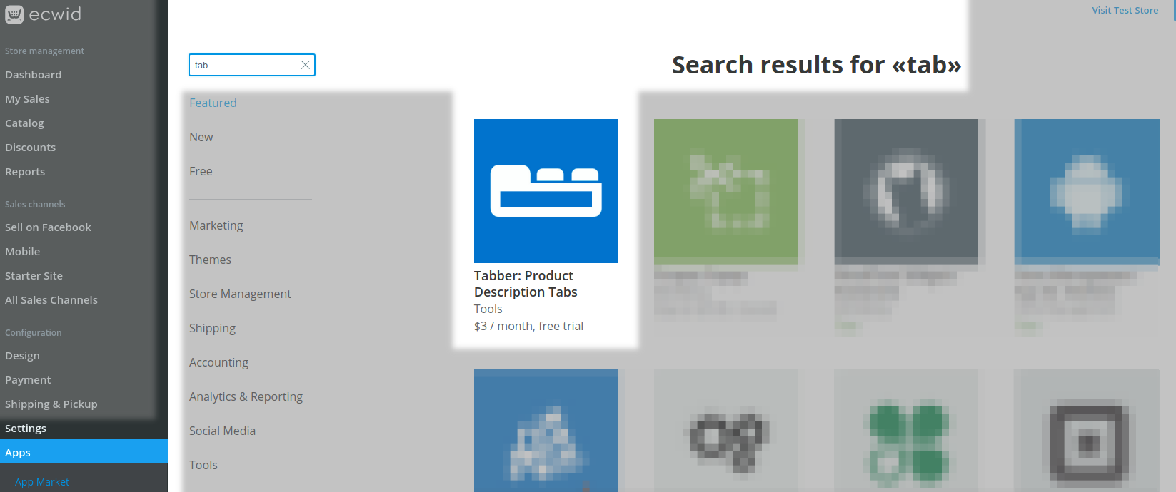
Install tabber from your Ecwid by Lightspeed Shop Control Panel, Apps page. This link adds a "Tabber" page to Settings > Design where you can now set your default tab theme and customise it with colors and other options .
Users of Website Builder services like Wix or Duda who partner with Ecwid to provide their e-commerce services can also use the Tabber App. More info ...
Choose a default tab style
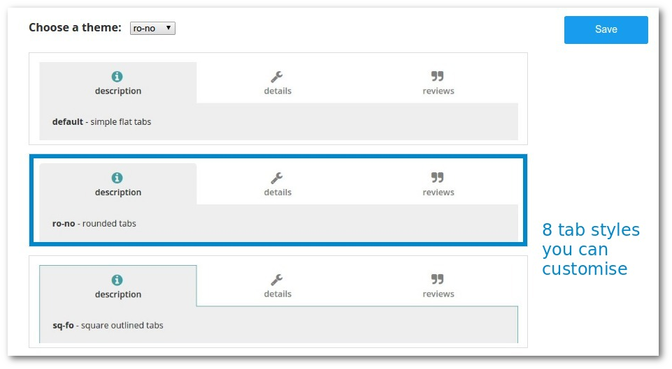
Click "Show Themes" to see the tab themes available and click on one to select it.
Or, just select the style by name using the dropdown.
Note. Some tab themes have an outline. The outline color will be the same as the "active icon color" regardless of whether you use icons or not.
Customising the default tab style
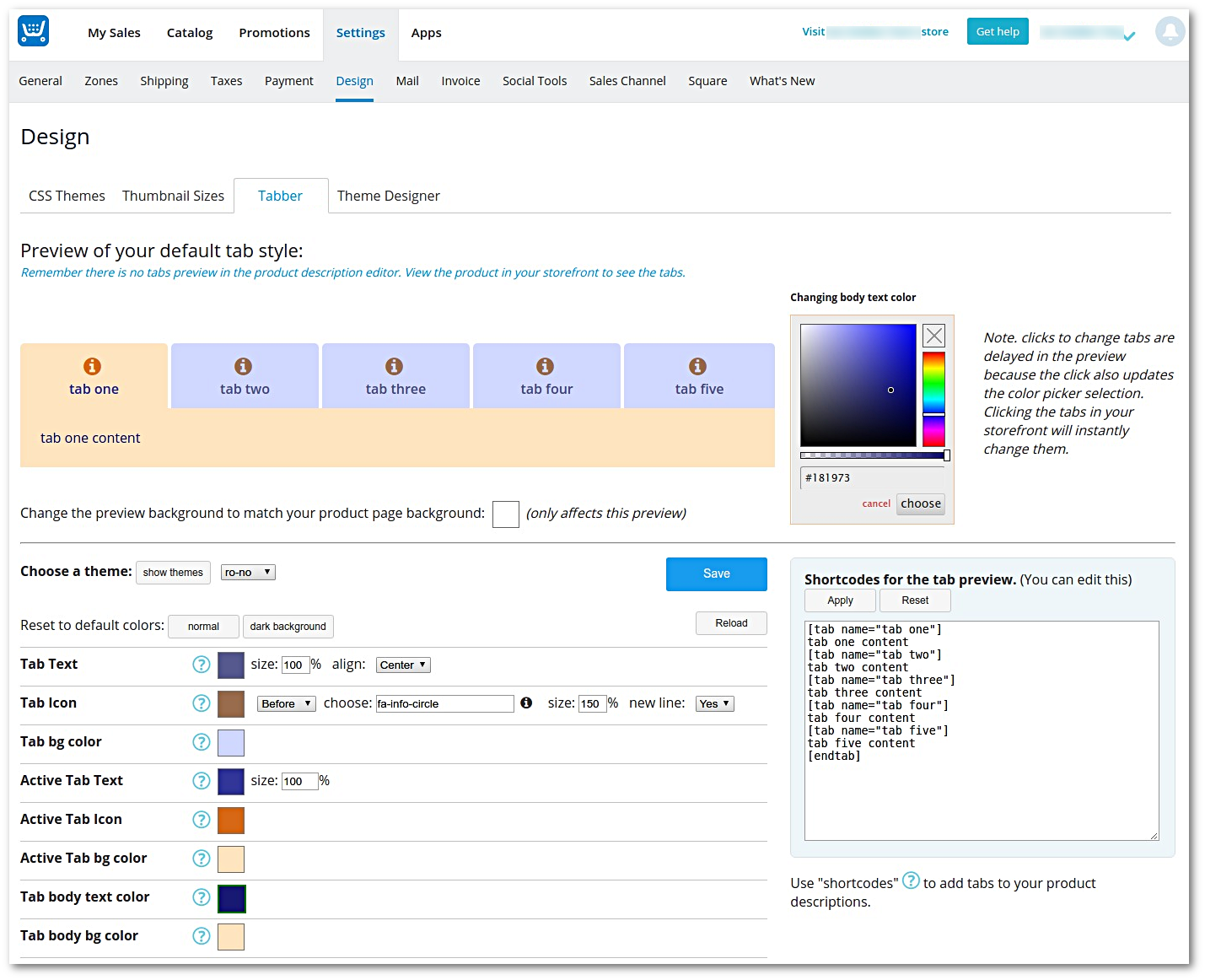
You can change text, icon and background colors by either clicking on the appropriate swatch, or the element within the tabs preview. Now use the color picker to adjust the color. Colors may be made semi transparent by using the slider under the color picker.
Tab text and icons can be sized between 25% and 300% of their default size.
The active tab may have different colours.
Tab text and icons may be aligned left, center or right, and you may have the icon(s) on the same line as the text, or a different line.
Text and icons that are too wide to fit in the tab space will be wrapped onto multiple lines.
Dark backgrounds
If your storefront has a dark background, use the page background swatch to set a background color to match your store. This background color is not part of the tab style which will always be applied over the background used on each product page. You can use the "reset to default colors" dark button to set default colors suitable for dark backgrounds.
Save your changes
Remember to save your changes to make them apply to the storefront. The "reload" button will discard any changes since the last save.
Preview
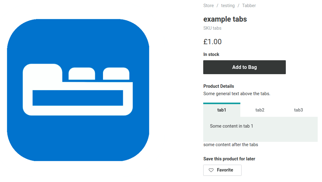
The preview area shows five simple tabs by default. It uses the content and shortcodes shown in the box at the bottom right.
You may edit the shortcodes if you like to change the preview. This is a great way to experiment with shortcodes before using them in product descriptions. Keep the tab content between shortcodes simple for the previews. This area is a simple text area and does not support formatting like the product description editor does. However, if you know html, you can use some simple html tags in the tab content between shortcodes.
Using shortcodes
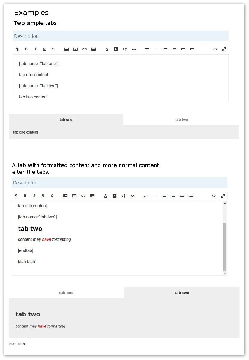
Use 'shortcodes' to add tabs to your product descriptions. Simply add [tab name='tab name'] to start a new tab with the label 'tab name'. The tab content will continue to the end of the product description or the next tab shortcode.
Note. you cannot preview the tabs in the description editor. Look at the product in your customer facing storefront to see the tabs.
If you need normal content after the tabs, use the [endtab] short code to indicate the end of all the tabs.
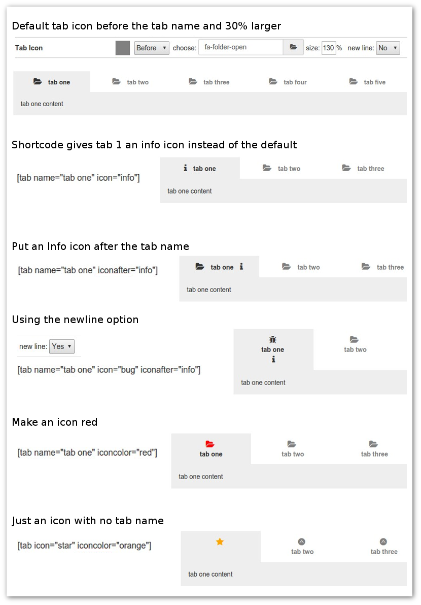
The tab shortcode has some options but you must always specify either name or icon . Here are all the options that are available:
- name='tabname' - the optional tab name or label
- color='color' - optional color for the tab name (if any). Any valid CSS color may be used here e.g. red, #f00, rgba(255,0,0,1), hsla(0,100%,100%,1) etc.
- icon='iconname' - the name of an optional icon placed before the tab name (if any)
- iconafter='iconname' - the name of an optional icon placed after the tab name (if any)
- iconcolor='color' - optional color for the icon(s). Any valid CSS color may be used here e.g. red, #f00, rgba(255,0,0,1), hsla(0,100%,100%,1) etc.
Shortcode options are wrapped with quotes. Singe quotes are recommended, because they are less likely to interfere with other text formatting code that may be added by the Ecwid description editor. However, adding text formatting to a tab name or other option by using the Ecwid description editor is not supported and may cause issues.
Do not apply any formatting to the shortcodes within your product descriptions, as this may cause errors. You may apply any formatting you like to the main tab content between the shortcodes.
If your tab name has a quote (') either escape it with a backslash (\') or use double quotes around the tab name e.g. name="tabname". You can escape single or double quotes.
If the tab shortcodes are not working, this is usually because of invisible formatting codes that have been added by the Ecwid description editor. The easiest way to fix this is to edit the description in HTML mode which allows you to see all of the formatting HTML tags and edit them. Check this page for some helpful tips to fix common problems.
HTML attributes - better Facebook support
The Ecwid Facebook, Instagram and mobile ShopApp apps do not support Tabber. This means that the tabber shortcodes can not be processed by the tabber code and converted into tabs.
An alternative method of defining tabs can be used which is more compatible with these apps. However, this method requires you to edit the product descriptions in HTML mode and add some special attributes to the HTML tags.
Basically, replace shortcodes like [tab name='tab name'] with an HTML heading tag for example <h3 data-tab-name="tab name">Tab Name</h3>.
So, the shortcode is changed to an HTML h3 tag with some special attributes used by Tabber (data-tab-name="xxx").
In this case When the Tabber code is not available (e.g. on Facebook) the text will look like a heading level 3, but when Tabber code is available, it will convert this into a tab.
Note. currently the Ecwid facebook app does not format headings, so the headings will appear as normal text.
The special attributes all start with data-tab- followed by the same values used with the normal Tabber shortcodes i.e. name, icon, color, iconafter, iconcolor.
The special attributes may only be used with certain html tags: headings (h2, h3, h4, h5, h6) and these empty tags (those with no closing </xx> tag): area, input, hr, br. For example <br data-tab-name="my tab">
<hx>heading text</hx>- where x is 1,2,3,4,5 or 6 shows the heading text on Facebook<area>- ignored on Facebook<input>- ignored on Facebook if type="hidden"<hr>- shows a horizontal line on Facebook<br>- starts a new line on Facebook
So, for example <hr data-tab-name="my tab"> will start a tab named 'my tab' but on Facebook will simply draw a horizontal line.
To mark the end of all the tabs (optional), use an html tag with the attribute data-tab-end="".
If you use the <input> tag, add a type="hidden" attribute unless you want an input element to be shown on Facebook.
You can not mix regular Tabber shortcodes and the special Tabber HTML attributes within any one product description. If any regular Tabber shortcode is found, the Tabber HTML attributes will be ignored and will not create any extra Tabs.
The video above shows how to change Tabber shortcodes to headings with special Tabber HTML attributes so that the description will look better on Facebook, Instagram and mobile when using the Ecwid ShopApp.
Using Icons
Icons can be specified for your default tab style and the same icon will apply to every tab. Use the "icon=" or "iconafter=" shortcode option to specify a different icon on a specific tab in your product description.
Icons may be selected using the icon picker, or by simply entering the name. You can look up the names of icons on the Font Awesome (Version 4.7) website. Currently, Tabber only supports icons from FontAwesome Version 4.7.
If you want a default icon, it can be before or after the tab name, and on a new line or the same line as the tab name. The default icon will show on every tab unless you override it with a shortcode option in your product description.
To use a specific icon on any tab, you use the icon and/or iconafter option on the tab shortcode in your product description e.g. [tab name="info" iconafter="info"] will place an info icon after the tab name. You can also change the icon color with the iconcolor option e.g. iconcolor="red"
The icon names are from Font Awesome Version 4.7 where you will find many useful icons. The "fa-" prefix on Font Awesome icon names is optional, so for example you can use either icon="info" or icon="fa-info".
Even if you specify "none" for icons in your default theme, the newline, size and color icon settings will be used as defaults for any icon you specify using a shortcode.
Positioning the tabs
The tabs normally are positioned within the product description where you placed the tab shortcodes.
However, since late 2017, early 2018, new Ecwid stores* have been using a new product details layout that allows some control over the layout by using the Ecwid API.
By default, the product description (including any tabs) appear in the sidebar. This may not be ideal if you are using Tabs, and you may prefer the description and tabs to be placed under the main product image.
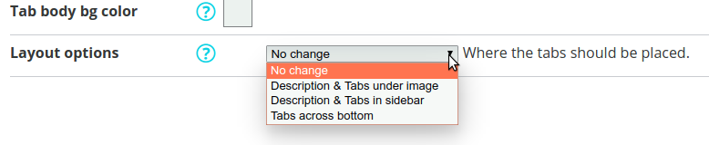
The new option "Tabs location" lets you specify where the tabs should appear in the storefront. Note. this option will only work on stores using the new product details page layout.
There are four options:
- No change - don't change the layout
- Description & Tabs under image
- Description & Tabs in sidebar
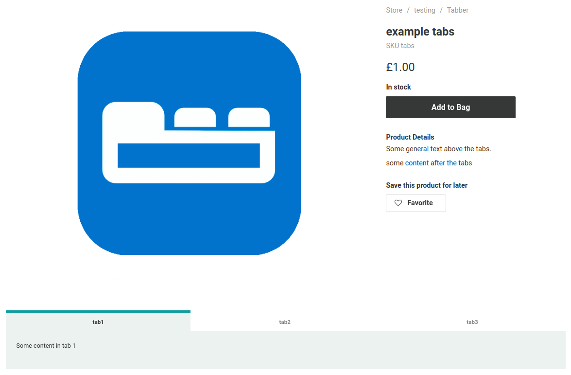
- Tabs across bottom - extract the Tabs from the description and place them at the bottom of the product details area across the full width available under the image and sidebar
*If your storefront is using the original Ecwid product details layout, these settings will have no effect. Newer Ecwid accounts use the new layout. Older accounts can enable the new layout by using the customize appearance options in the Ecwid API.
It is expected that Ecwid will soon make the new product details layout available for all older accounts as an option in the Control Panel (Settings > What's New?), with more layout controls in the design settings section.
Layout options:
Description & Tabs under image:
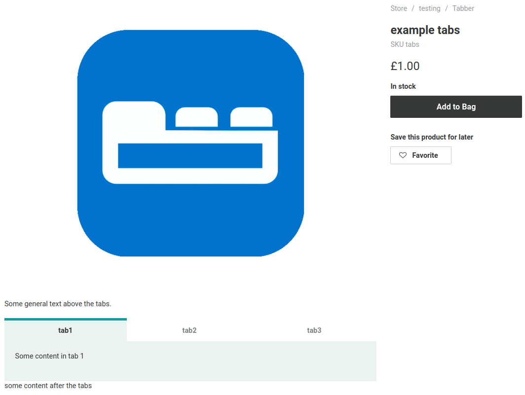
Description & Tabs in sidebar:
Tabs across bottom: